Brief
Shoku is a new range of darts inspired by the beauty of craftsmanship and handmade tradition. The identity takes cues from the Japanese word Shokunin, meaning ‘craftsman,’ and celebrates the precision, care, and artistry found in handmade objects such as pottery, leatherwork, woodcraft, and jewellery. The theme, Handmade Heritage, focuses on bringing that same sense of dedication and authenticity into the world of darts.
Outcome
I created a visual identity that brought this story to life while keeping it consistent with Target’s existing brand style. I worked with natural textures, refined typography, and understated design details to reflect the honesty and tradition of handmade goods, resulting in a brand that feels both crafted and contemporary. Something that speaks to both artisans and darts players alike.
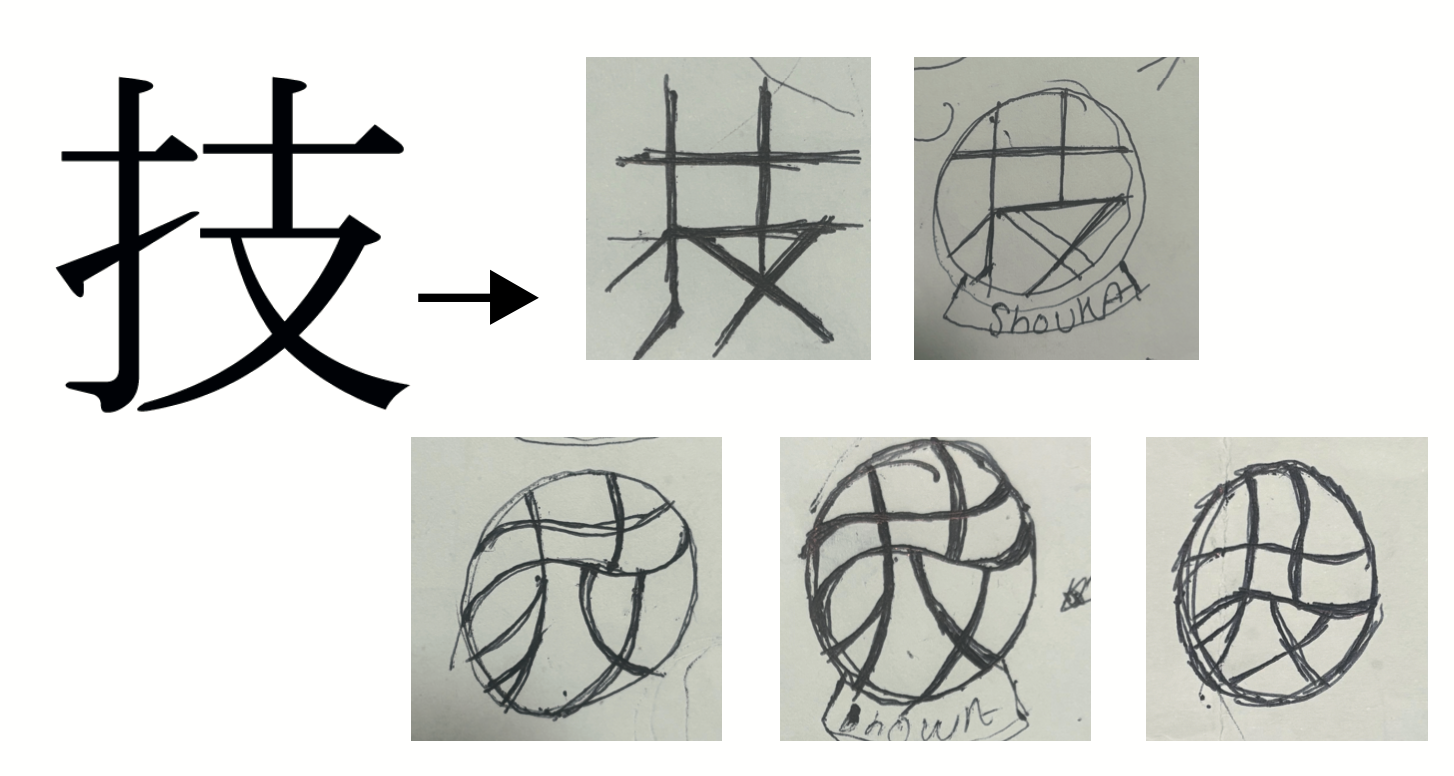
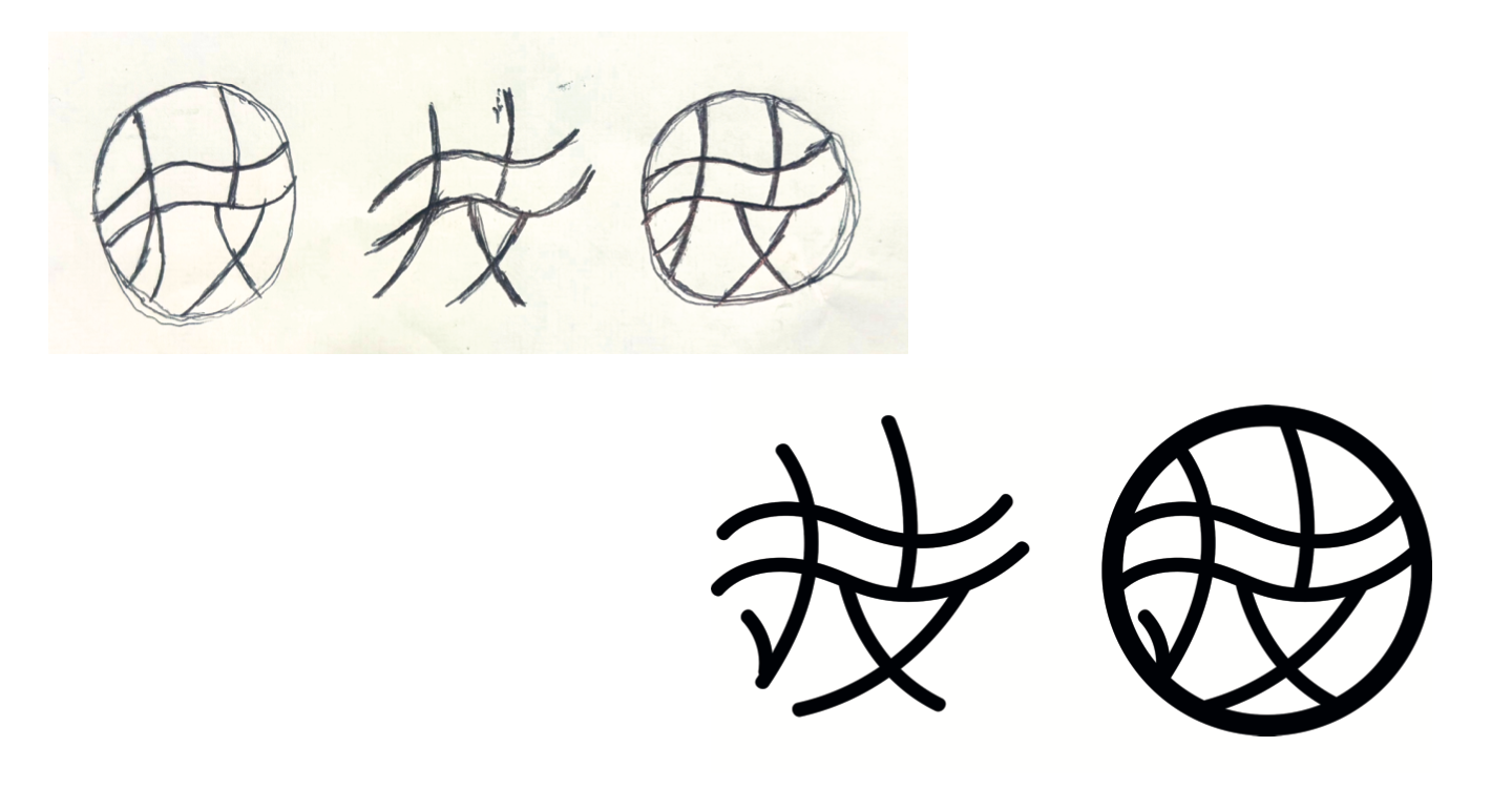
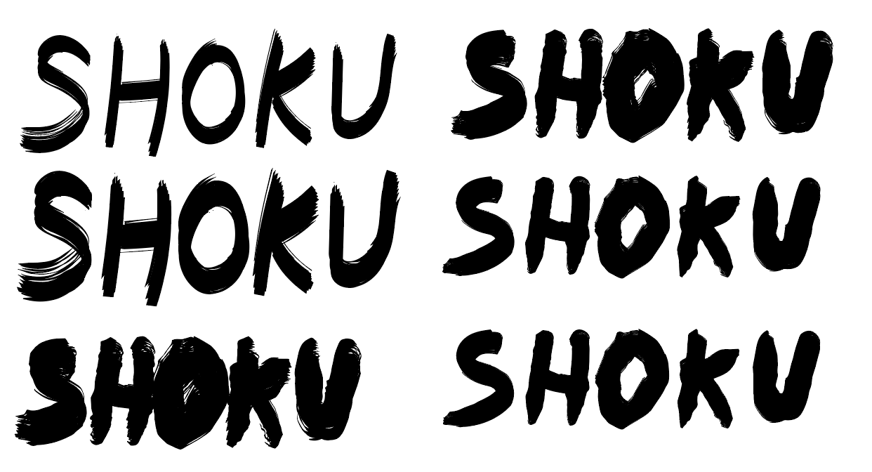
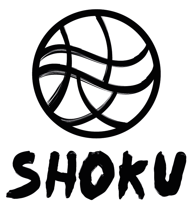
This was the stage where I began developing the brand logo. The concepts of skill and technique stood out to me, as both craftsmanship and darts rely heavily on them. Creating a logo based on these ideas seemed like an effective way to convey the brand’s message. I started with rough sketches incorporating the kanji for skill (技, waza) to explore a distinctive logo design.I experimented with brush strokes similar to kanji brushes, adding my own twist to respect Japanese culture. The flowing lines represent skill in motion, connecting both artisans and dart players, who rely on fluidity, precision, and control. I also played around with the lettering to give a modern twist. This sense of movement and style helps the icon capture the essence of Shokunin, blending mastery with artistry.
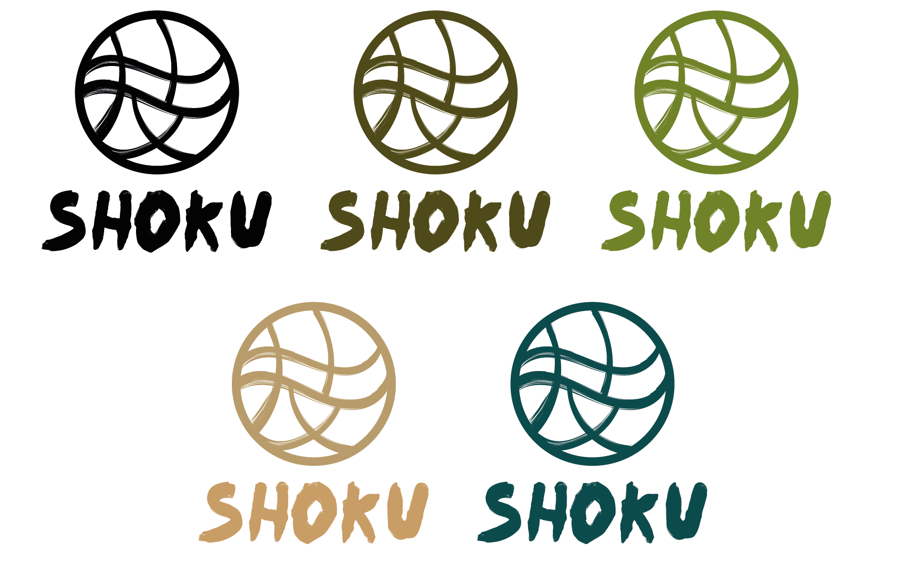
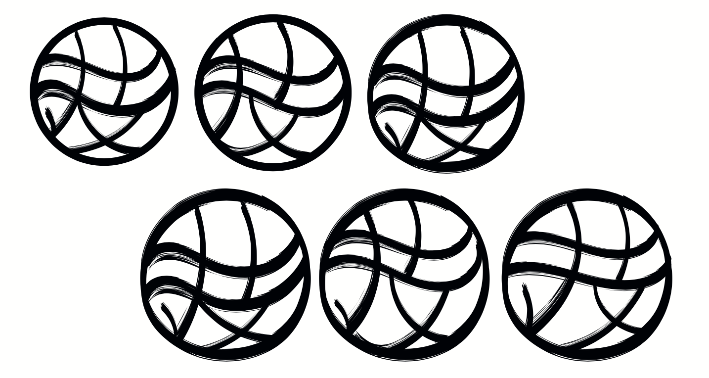
The Shoku logo uses natural, earthy tones to reflect Shokunin craftsmanship. These colours draw inspiration from nature, highlighting authenticity, skill, and the timeless quality of handcrafted work.
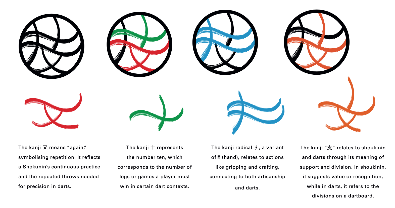
Logo Anatomy
The logo anatomy breaks down the individual sections of the symbol, highlighting their meaning. Each part carries strong visual significance, reflecting craftsmanship, skill, and precision.
The Shokunin philosophy of refinement, balance, and ongoing improvement is at the heart of the design. The combination of structured and flowing brushstrokes reflects both precision and artistry, striking a balance between control and energy. I’ve used natural colours to create a strong connection with Shokunin craftsmanship, as nature often inspired the methods used in traditional crafts. Thoughtful colour choices make the flights feel dynamic and purposeful, echoing the way a craftsman continually hones their skills. The result is disciplined yet expressive, always aiming for perfection.
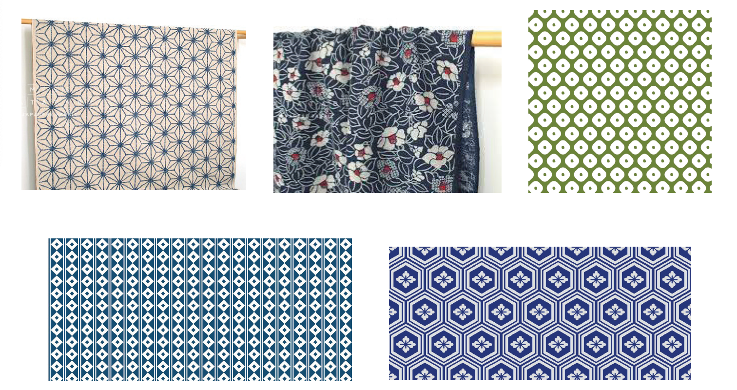
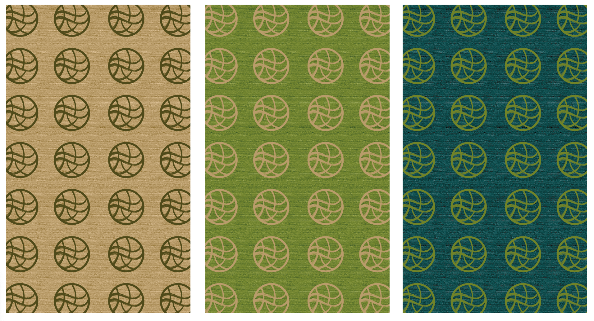
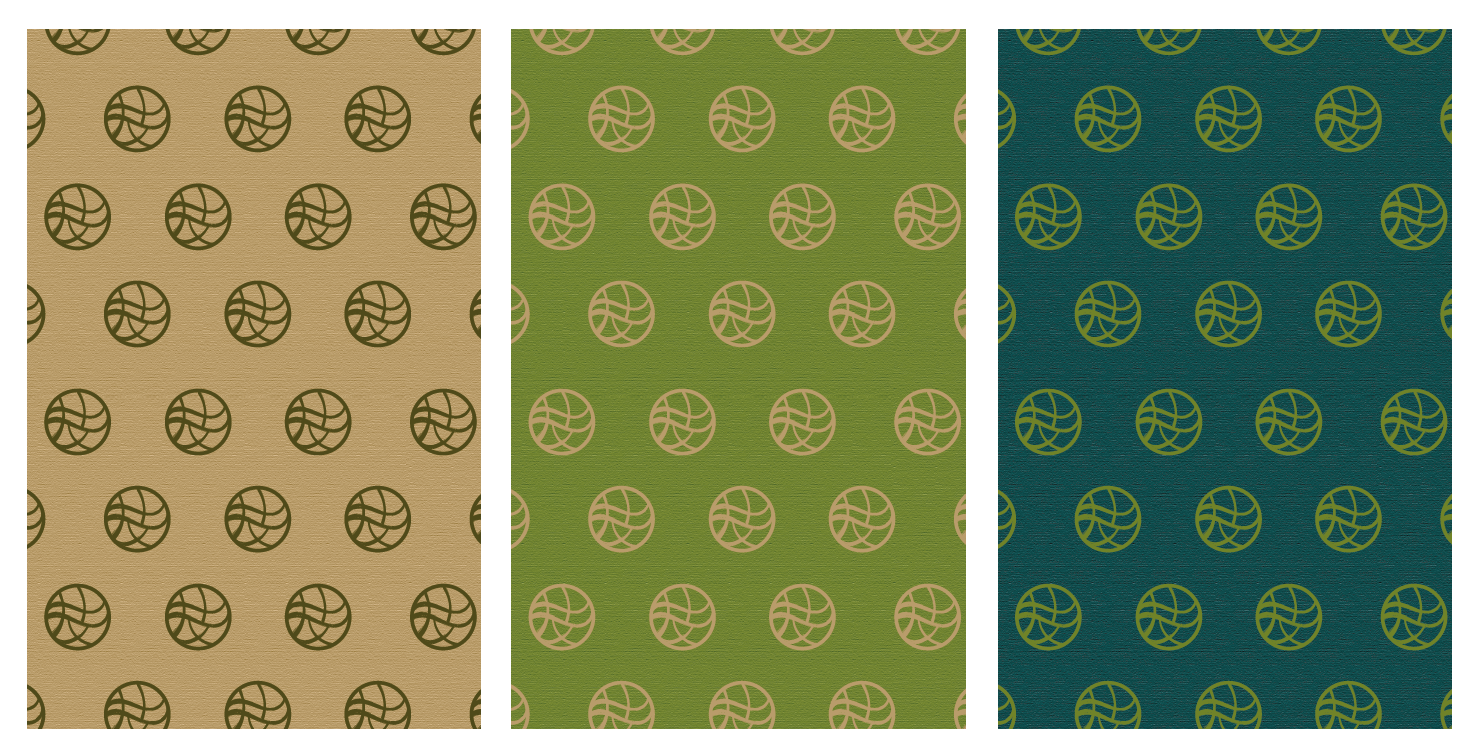
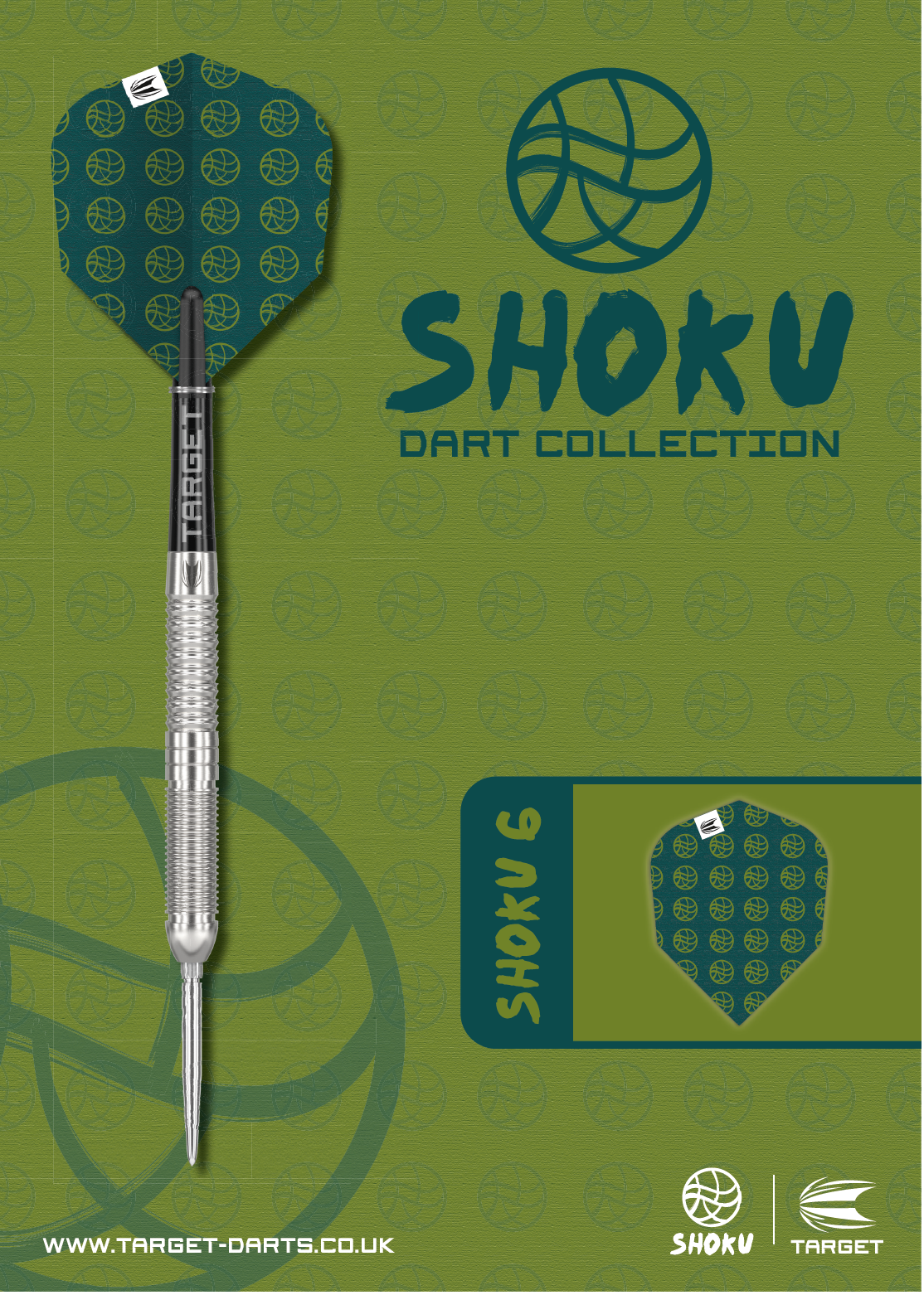
I created Fly Dart designs inspired by traditional Japanese Shokunin patterns, which are known for their intricate craftsmanship and cultural significance. These patterns often featured geometric repetition, organic flow, and a sense of harmony, which I incorporated into my work. By blending these timeless elements with a modern approach, I designed unique and visually striking pieces that celebrated the artistry and elegance of Japanese textile traditions. I didn’t want to limit myself to just one pattern sequence, so I experimented with different variations to add more variety. Instead of the original design, I explored a narrower pattern sequence, taking inspiration from Shokunin textile patterns that are arranged in linear formats rather than diagonals. This approach adds a different visual rhythm while still maintaining the structured, handcrafted feel that reflects traditional craftsmanship.
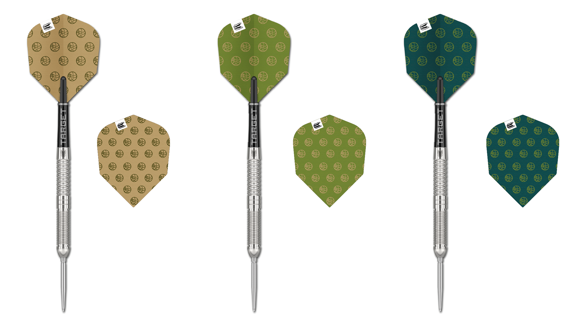
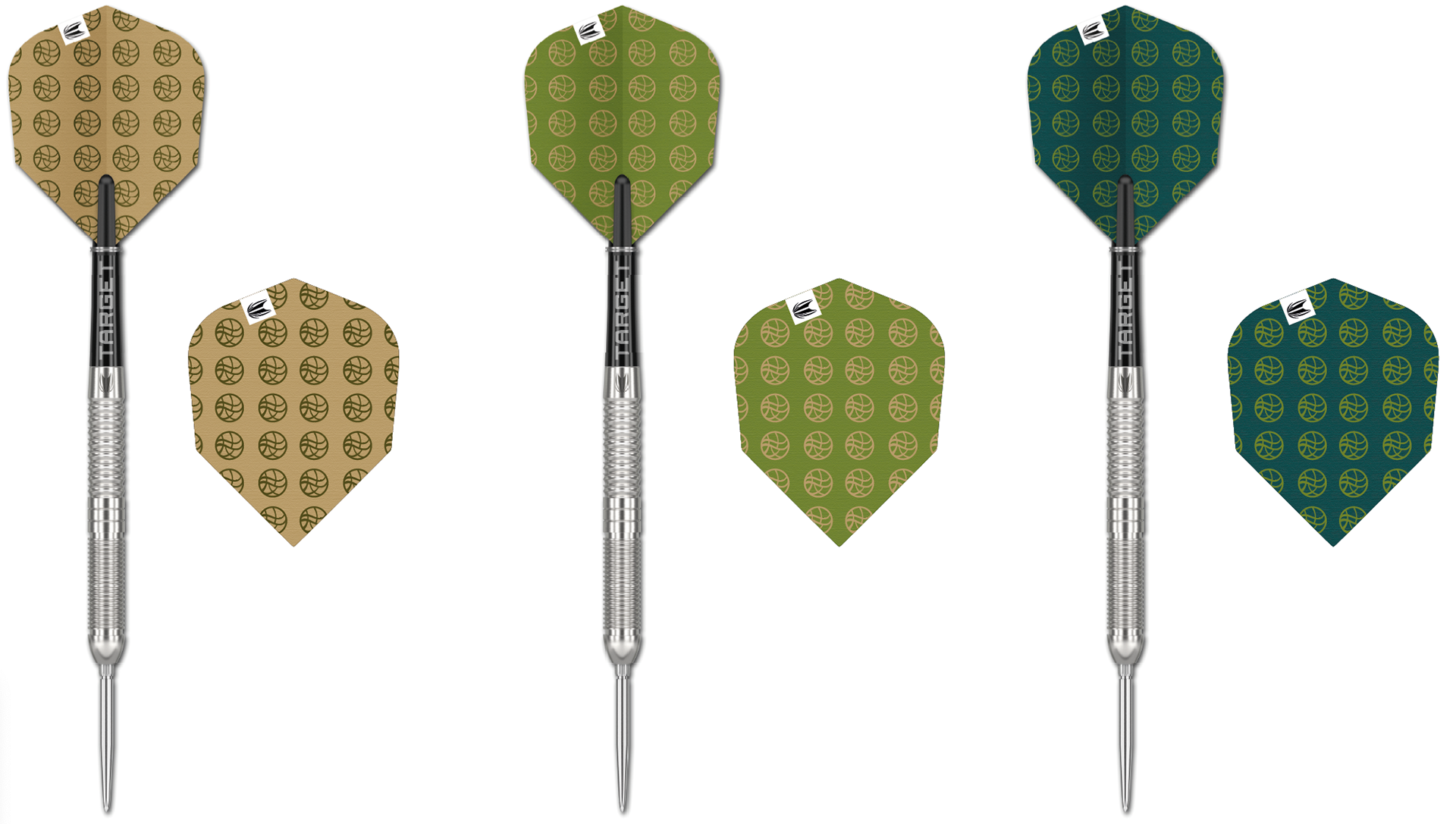
I created Fly Dart designs inspired by traditional Japanese Shokunin patterns, known for their intricate craftsmanship and harmony. I experimented with different variations, including narrower, linear sequences instead of diagonals, to add visual rhythm while keeping the handcrafted, structured feel. This blend of traditional elements with a modern approach resulted in unique, visually striking designs.
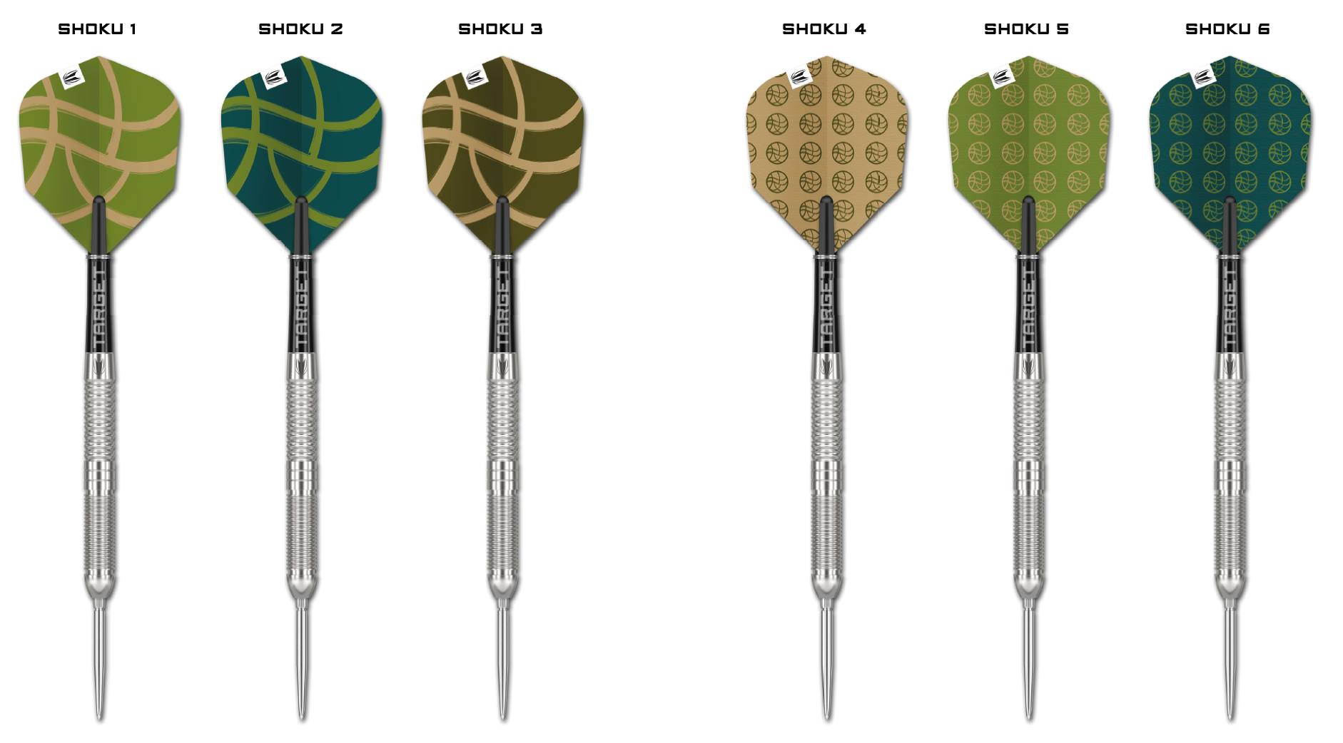
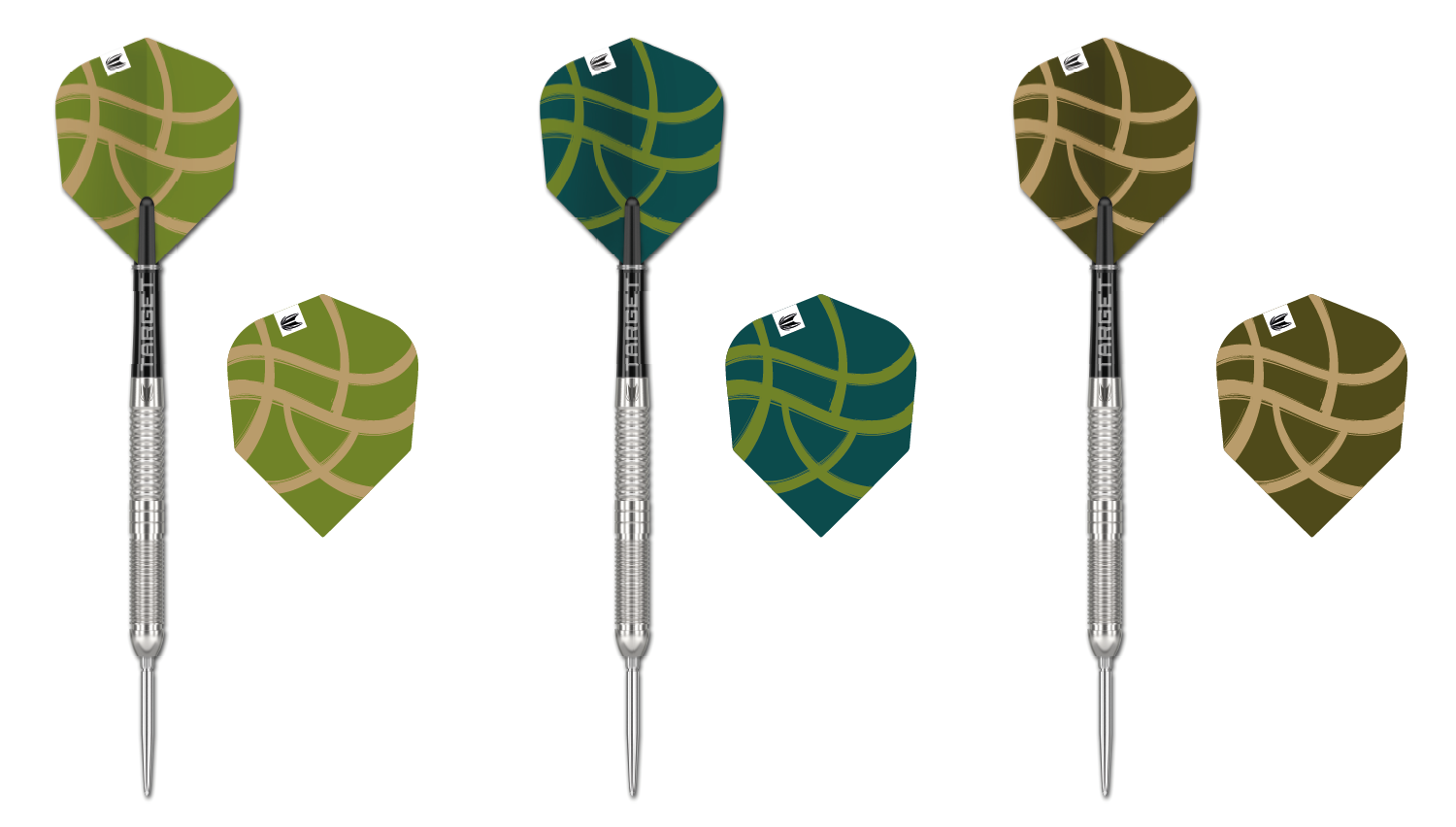
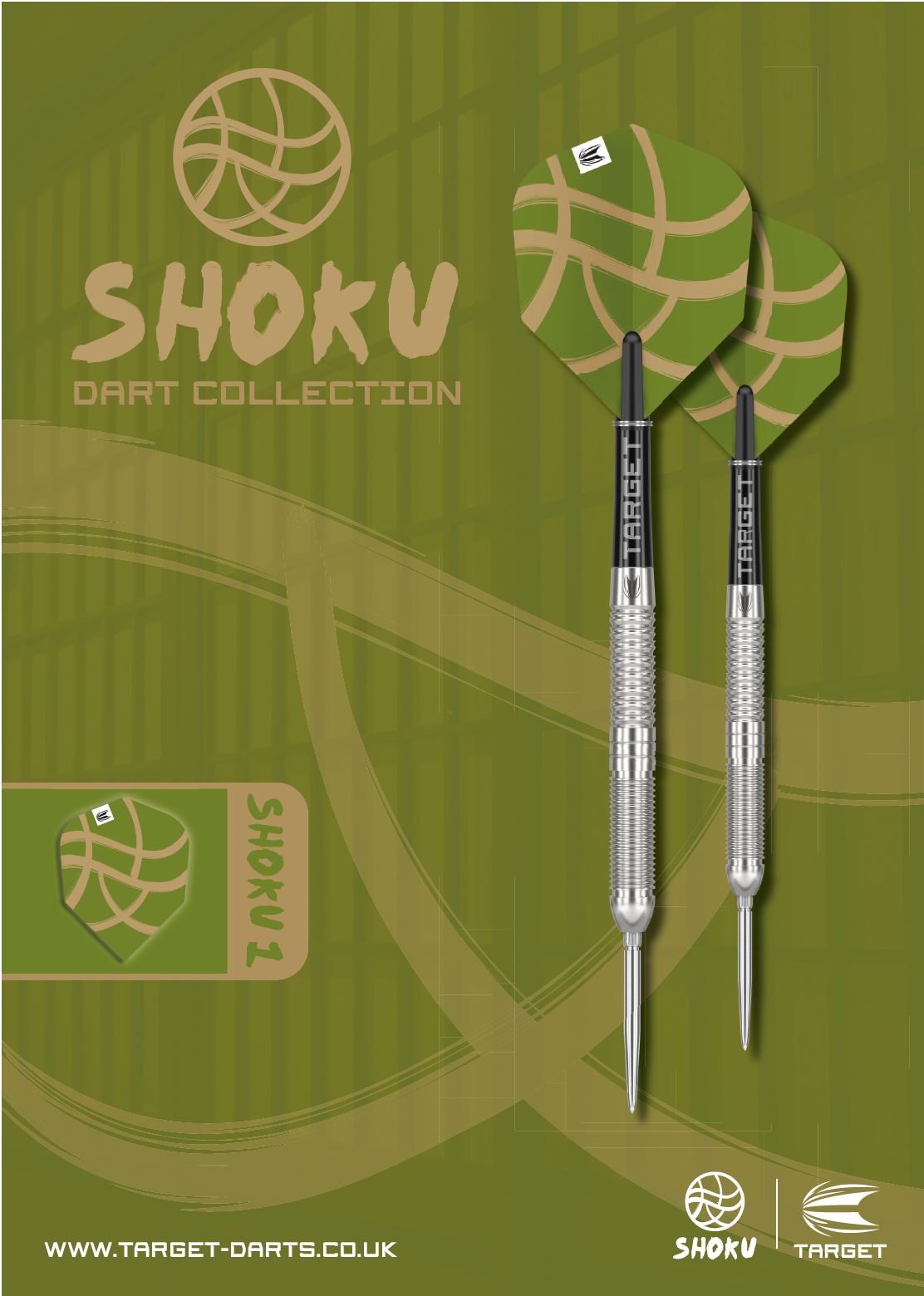
Shoku Dart Collection
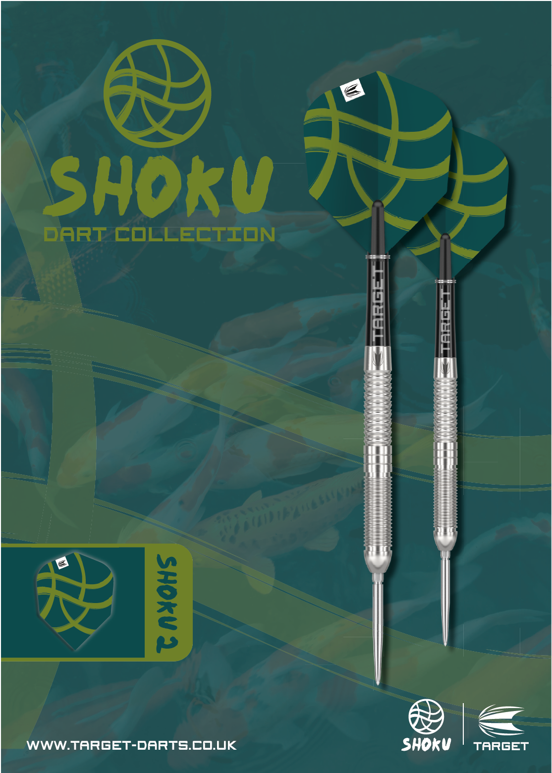
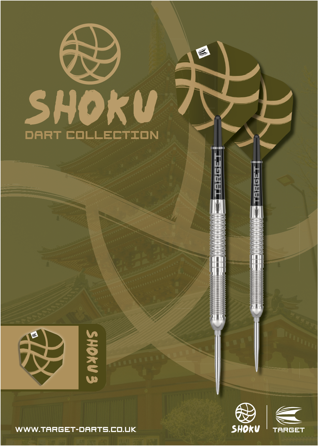
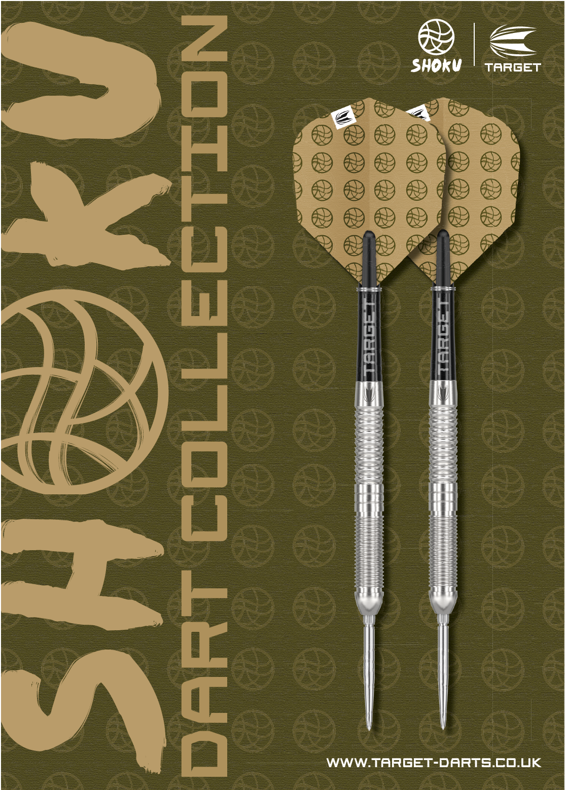
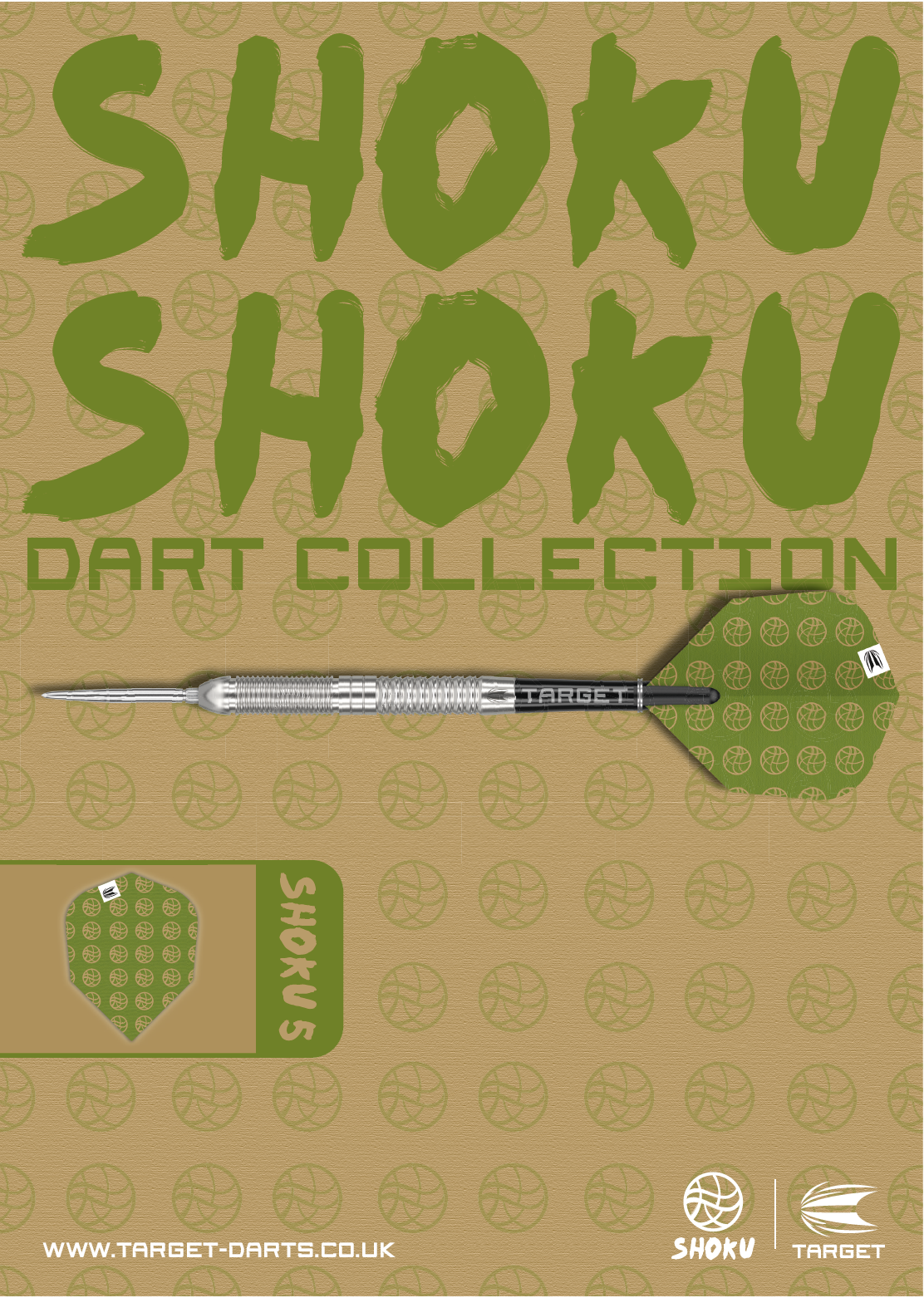
Shoku Dart Posters
The Shoku dart posters highlight key darts terms while celebrating Shokunin craftsmanship, making them a great way to market these products. They incorporate Shokunin textile patterns, reflecting structure, repetition, and precision, which are qualities shared by both darts and traditional Japanese artisans.
The posters also integrate elements of the logo to visualise movement and flow, echoing the path of a dart toward the board. Poster 3, Full House, features a grid-like pattern representing balance and control, while Poster 2, Big Fish, uses “SHOKU” text and fish illustrations to convey refinement and ambition. Kanji characters and brush strokes enhance the rhythm, linking the designs to both darts and traditional craftsmanship.